About the project
Design
The target audience I went for is parents and teachers of kindergarten kids. For the game idea I decided a quiz could be a fun way for kids to learn and become more motivated about environmentalism. So, the ultimate goal of my website is to convince teacher and parents to get kids to play the climate quiz.
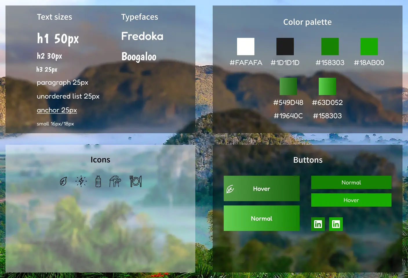
The very first thing I did was set up a Trello to ensure that I kept track of what my plan was and the exact steps I needed to take. I wanted to have the entire layout and look of the website figured out before I started coding. In order to do that I ended up creating not just wireframes for the mobile, tablet and desktop versions, but also a style guide and prototype, which can all be viewed on my Figma project.
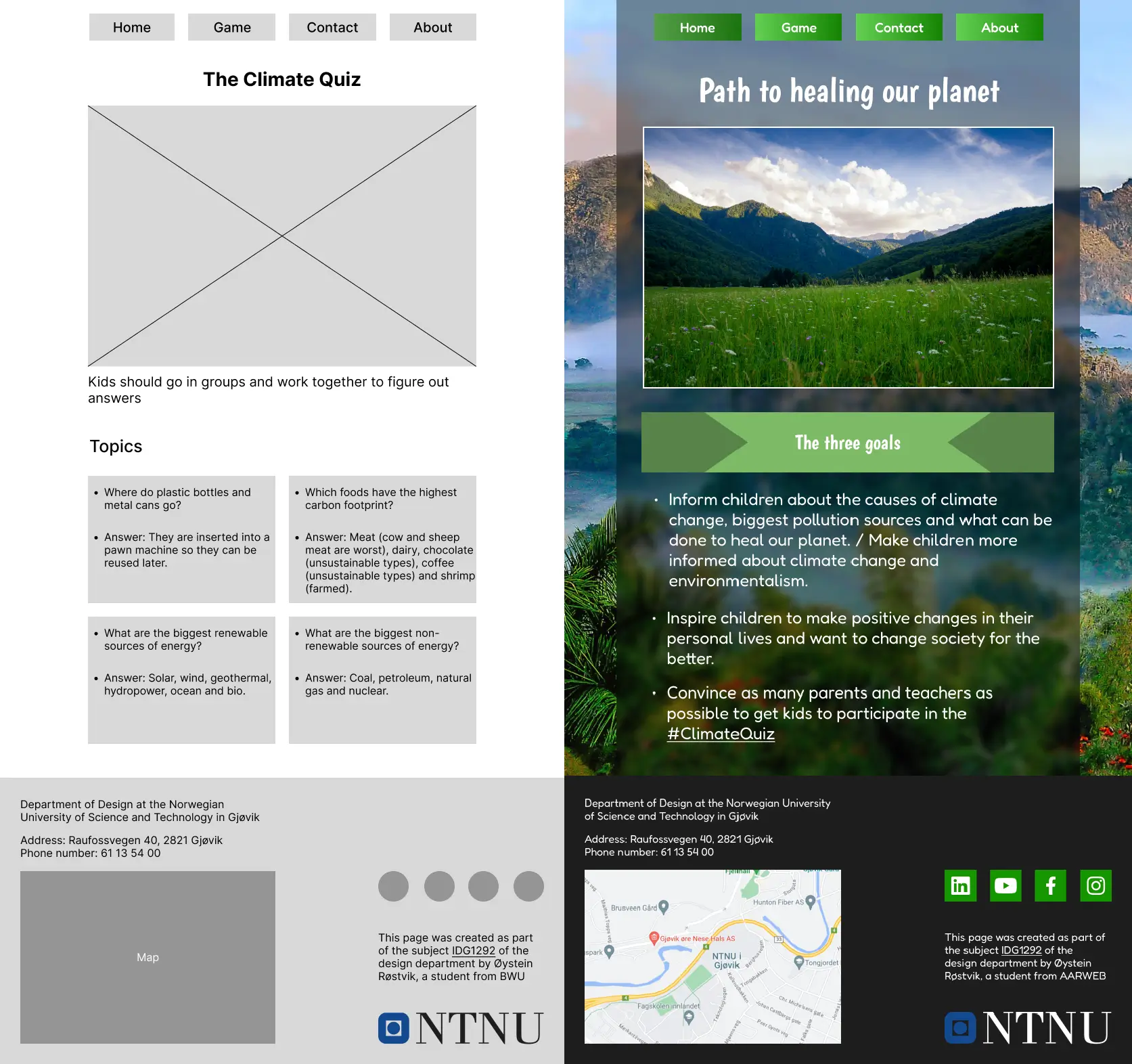
I went for a mostly professional, trustworthy and minimalist design. But the headings typeface is childish, and the paragraph typeface soft, just to convey that the website does still have the kindergarten kids in mind. Of course, readability was always prioritized.
For the header I decided that four separate button links to each page would look best, and be easier to move around for the different layouts. The desktop layout has the navbar moved to the right side of the page, not only in order to reduce white space on wider screens, but also to push the main content more to the left, which is better for English speaking users that read from left to right.
The NTNU logo is very large on mobile, but that is because I want the layout to be very consistent, which means the footer elements must have all the same width.
In the navbar I added a leaf icon to the current page button, in order to not just rely on color to inform the user which page they’re currently on, because that could be problematic for color blind users.
Structure
I’ve tried my best to keep the project well organized, with an easy to navigate file structure. All of the file types are separated into their own folders, and only the assets have a sub-folder, in order to separate the icons, images and typefaces.
Sustainability
All image files were converted to webp format and compressed, which resulted in around 70% reduction in file sizes. The pdf of the quiz cards has also been compressed. The typefaces are in the project as local files instead of being imported using the Google Fonts CDN, in order to avoid network requests. Typefaces have also been converted from ttf to woff2 for smaller file sizes. I’ve also tried my best to follow the DRY principle, to keep the code clean, efficient and as eco-friendly as possible.
Code
I debated putting the sidebar navigation in an aside, but since it is not related to the page content it didn’t seem appropriate. Ended up using more media queries than I wanted to, because some elements like the flip cards, navbar leaf and arrows in the h2 banner on the front page required some extra code for very small screen widths.
I used the same naming convention for all my classes and ids. Tried to correctly use the article, section and figure elements, to make the HTML more semantic.
I gave the tabindex attribute a value of 0 to make the cards focusable, and used the focus pseudo-class for making the hover animations play when the elements are focused. This makes the cards accessible for people relying on keyboard navigation and screen readers. Also used the title attribute on some links to inform people with screen readers that they open in a new window. Added descriptive alt text to the article images.
Used Shorthand properties as much as possible in the CSS. I tried to add some comments in CSS to organize it into different layouts, but I admit that comment is something that I need to get better at.
My impression during this project was that the very simple layouts were easier to create using flex, while grid seemed the most appropriate for the footer since it had many elements and required a more complex layout.
Sources
Typefaces:
Images:
- Website background image by Simon Berger
- Home page image by Nikola Majksner
- Game page image by Ben Wicks
Icons:
- Leaf icon by Burhan Adiatma on Vecteezy
- Abstract Vectors by Vecteezy
- Bottle icons created by Freepik - Flaticon
- Restaurant icons created by Freepik - Flaticon
- Energy icons created by Pixel perfect - Flaticon
- Pollution icons created by Freepik - Flaticon
Validators:
Card flip animation and accessibility:
- How to create a flip card with CSS - W3Schools
- How to make interactive flipcards accessible to screen readers - Stack Overflow